IKEA Names Wild Fig, a Deep Burgundy-Purple, Its 2027 Color of the Year
IKEA's 2027 Color of the Year is Wild Fig, a deep burgundy-purple chosen for comfort and self-expression. Home Furnishing Direction Leader Abbey Stark calls it grounding yet unexpected.
- Section
- Interiors
- Author
- By Amara Osei
- Filed
- Length
- 3 min read
Key takeaways
- IKEA named Wild Fig, a deep burgundy-purple, its Color of the Year for 2027.
- The retailer's first Color of the Year was Electric Blue in 2025, followed by Rebel Pink.
- Abbey Stark, IKEA's Home Furnishing Direction Leader, said the shade balances comfort and self-expression.
- IKEA recommends Wild Fig for color drenching small spaces or as accents through textiles and decor.
- Stark suggests pairing it with creams, beiges, dark reds and powdery pale blue.
IKEA has picked Wild Fig, a deep burgundy-purple with a botanical undertone, as its Color of the Year for 2027 — and it's a deliberate break from the brand's louder picks. The announcement lands just two years into the retailer's history with the format, which began in 2025 with Electric Blue and continued with Rebel Pink last year.
The first two were memorable. Electric Blue matched the IKEA logo and its reusable blue bag almost exactly; Rebel Pink traded on mid-2010s millennial-pink nostalgia. Fun, yes. Usable in a real living room, less so.
Wild Fig is different. It sits squarely inside the moody-shade trend that has been building all year, and it reads as a classic rather than a stunt — the kind of color you could commit to now and not wince at in twelve months.
Why IKEA chose it
Abbey Stark, IKEA's Home Furnishing Direction Leader, said: 'Wild Fig was selected for its ability to bring together two important ideas shaping how people think about their homes today: a desire for comfort, warmth, and connection to nature, alongside a growing appetite for individuality and self-expression.'
She added: 'Its rich, botanical purple tone feels both grounding and unexpected, offering a fresh way to bring personality and depth into everyday spaces. It also reflects a broader shift toward homes that feel more personal, expressive, and full of character, rather than overly polished or perfectly coordinated. Wild Fig strikes that balance beautifully: it's bold enough to make a statement, yet versatile enough to feel right at home.'
The pick tracks a wider design shift. The chicest homes are no longer the sleekest or most neutral; they're layered, lived-in spaces that reflect a personality.
How to use it
Wild Fig scales to whatever level of commitment you can stomach:
- Color drenching: taking the shade across every surface in a small powder room or home office blurs the edges of the space, creating a dark cocoon that never feels overwhelming.
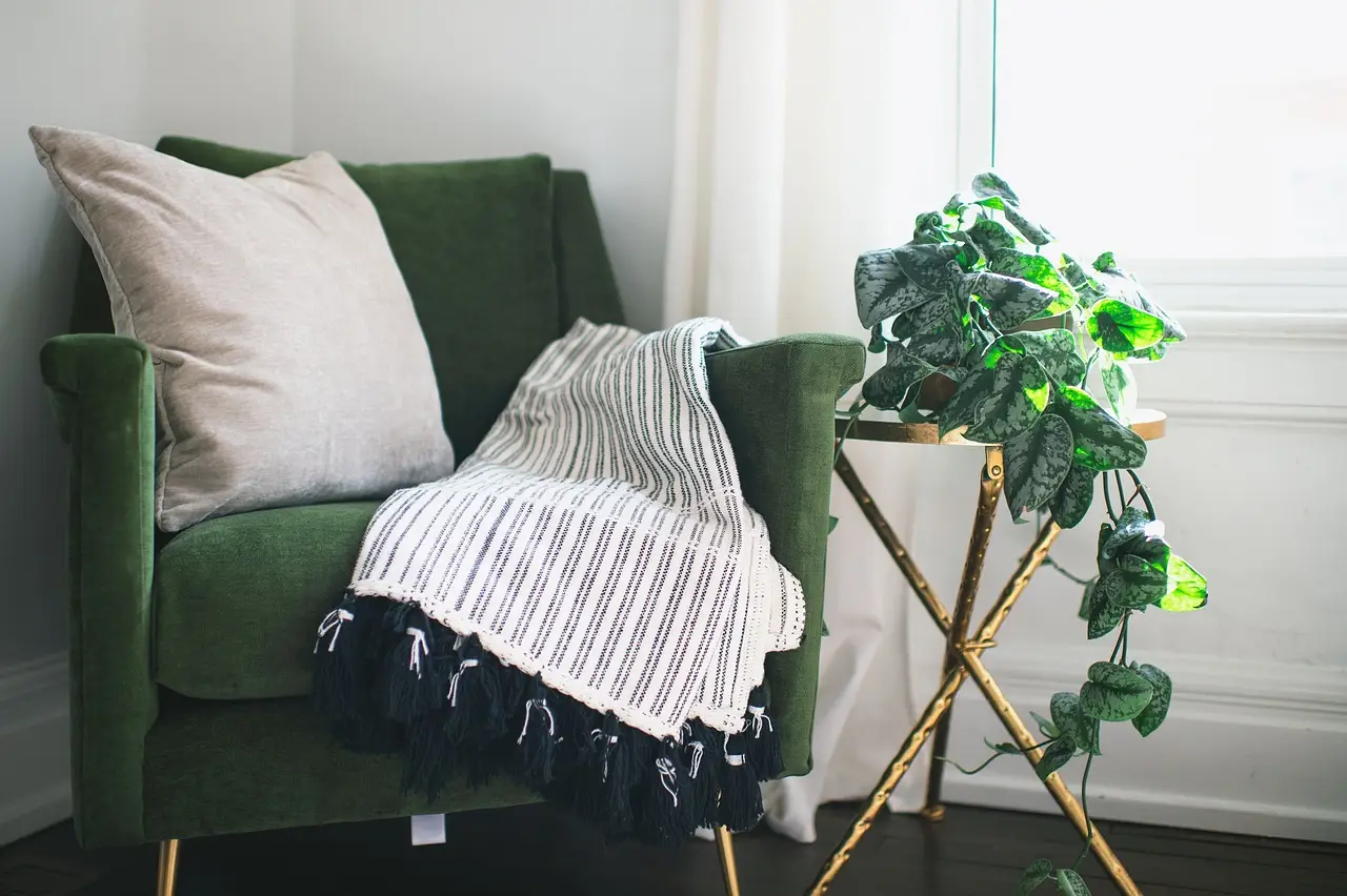
- Accent pieces: IKEA stocks decor in the exact deep burgundy — throw pillows on a bed, a lamp in a living room, a rug in an entryway.
'What makes Wild Fig so special is that it isn't quite a traditional burgundy. It has a rich, botanical purple undertone that gives it a little more unexpected character,' Stark said. 'It's dark and grounding, but also feels imaginative and expressive, bringing depth to a space without feeling overly serious. I also love how adaptable it is. You can use it to create an enveloping, dramatic moment across a wall, or introduce it in smaller ways through textiles, furniture, and decor. It has a real presence, but doesn't have to overwhelm a room.'
What pairs with it
Wild Fig sits comfortably in a layered neutral scheme with creams and beiges. The sharper, more current pairing is dark reds set against a powdery pale blue — two shades that shouldn't work together but land as balanced rather than clashing.
'I think there's something inherently comforting and timeless about deeper, richer tones,' Stark added. 'Burgundy and shades like Wild Fig have a natural warmth and depth that make a space feel inviting, while still bringing a sense of sophistication and personality. What makes these colors so appealing is their versatility: they can feel cozy and grounding when paired with natural materials and softer neutrals, or bold and expressive when combined with brighter colors.'
After two years of logo blue and nostalgia pink, IKEA has chosen a color people will actually paint a wall in. That's the shift worth watching: the trend machine has stopped shouting.
Source: homesandgardens.com
More from Amara Osei
Show full bio
Market editor covering companies, deals and strategy in construction industry, architecture, interior design at Built Current.
398 articles